Daikin Logo

Enterprise Laboratory Information Management System (LIMS).


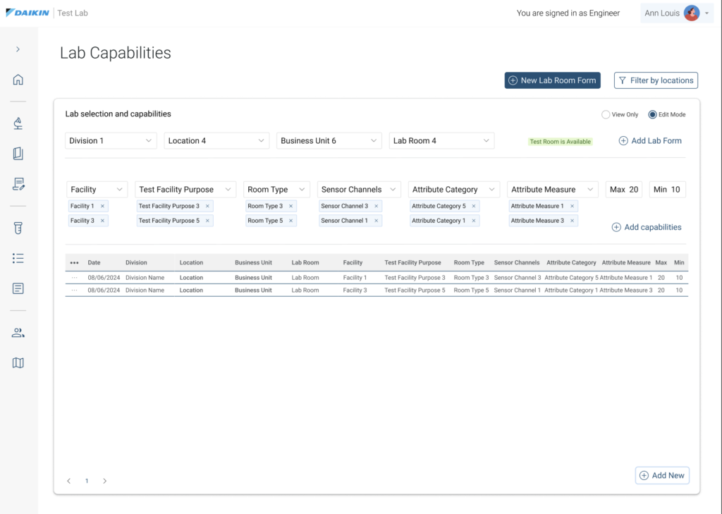
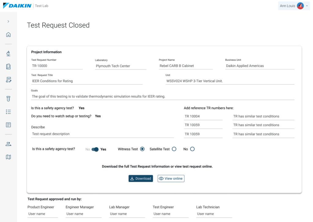
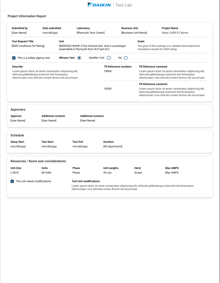
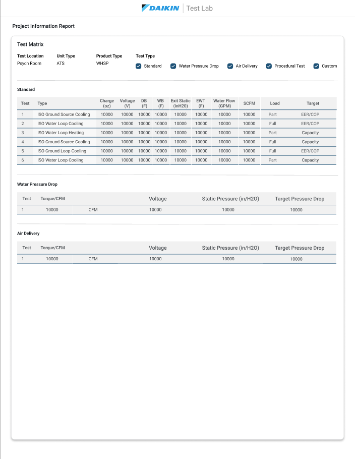
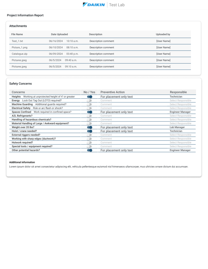
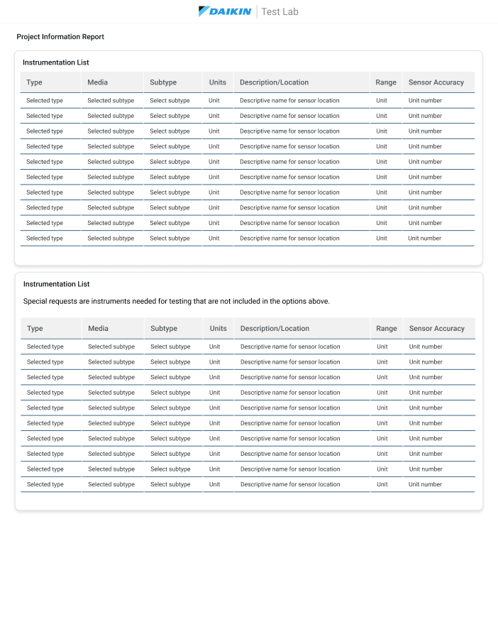
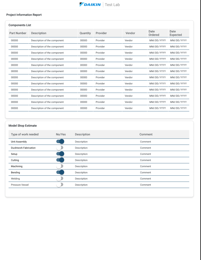
I worked as the lead UX and product designer on LIMS, Daikin’s internal Laboratory Information Management System, replacing Excel-based workflows with a single platform for test request submission, approvals, scheduling, and lab capability management. Working in an agile team alongside engineers, PMs, and other designers, I led user research and information architecture for a system serving seven distinct roles — from Lab Technicians to Stakeholders — each with different responsibilities, data needs, and permissions.


Skills

User research

Design System

Information Architecture

UI and component integration

UX strategy and Audits

Agile

Tools

Figma

FigJam

Miro

Figma AI

Notion

Claude Code

Notebook LM

Project Directory

Role
Key Responsibilities
Methods
Teams Involved
Focus Areas
Project Type
UX & Product Designer
Information Architecture, User Search, User journey maps, UX implementation, Design Systems, Accessibility implementation, Prototyping and development ready hand off documentation.
Agile environment and Sprint planning
Cross-functional Agile Environment: Engineers, PMs, Design Peers, Executive Stakeholders.
User research, information architecture, personas and journey mapping, workflow design, contribution to a shared design system
Heavy data Laboratory Management System Integration. Onboarding users to new workflow.

“Migrating from Excel it’s about reshaping an entire operational workflow. The challenge was advocating for human intuition inside a platform natively defined by heavy engineering constraints.”

– Abril J. Alejo

Key Insights & Impact

Designing From Zero, for Five Roles at Once

What I did: Ran user interviews and research with Product Engineers, Engineering Managers, Lab Managers, Test Engineers, and Lab Technicians to understand how each role actually used the existing Excel-based process, since no prior digital system existed to learn from.


Design Approach:
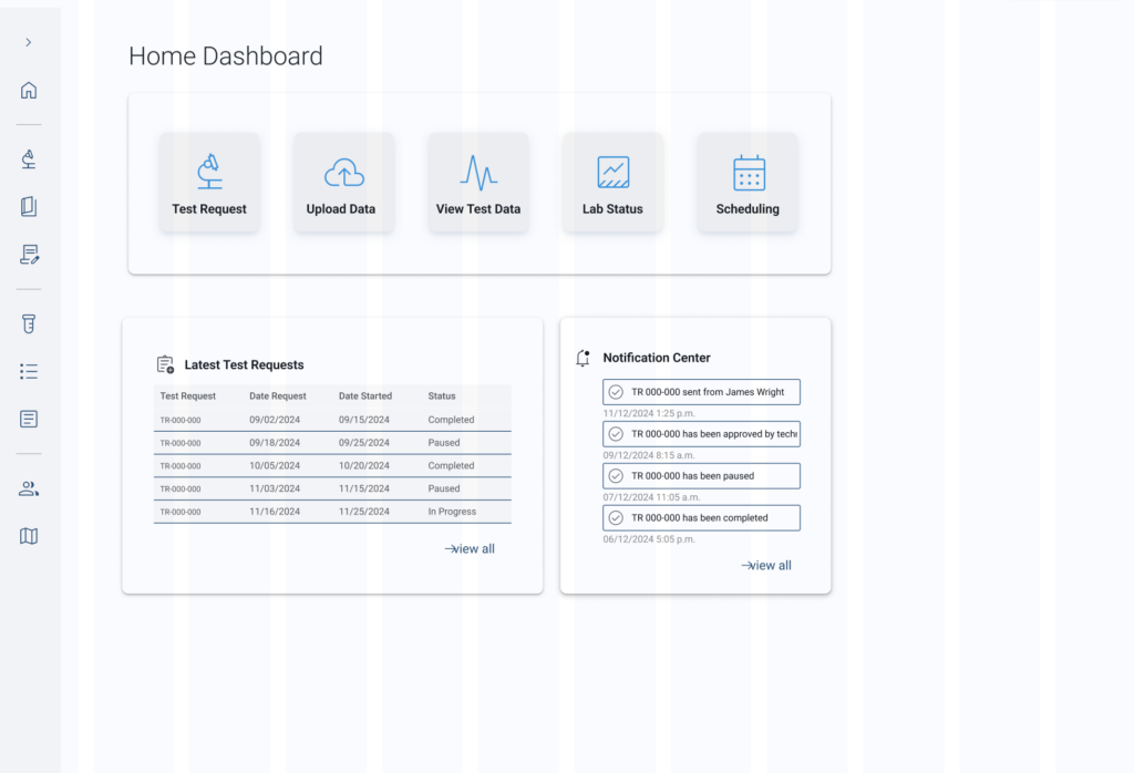
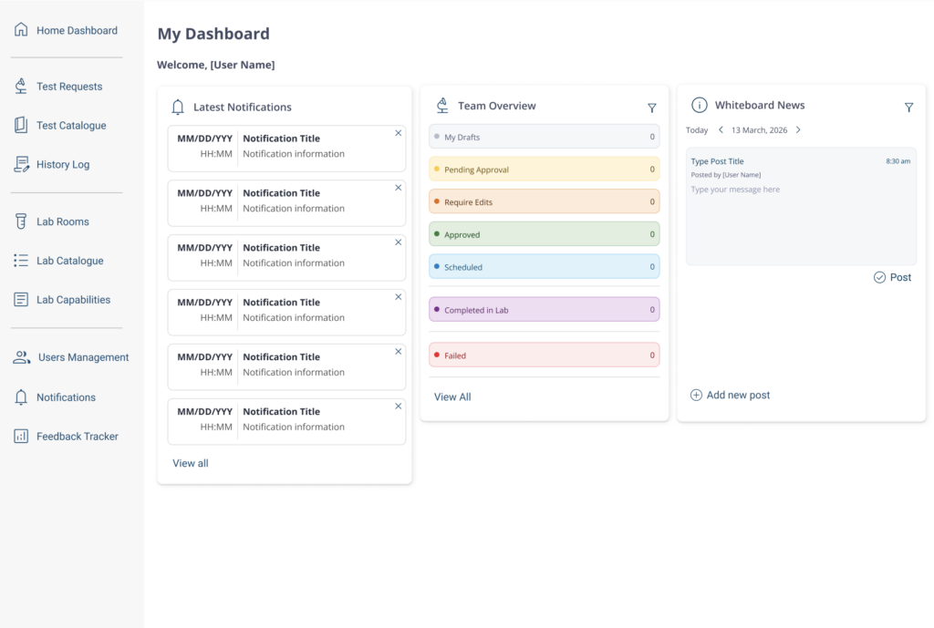
Built personas, journey maps, and a permissions-aware information architecture so each role saw a personalized dashboard and workflow, rather than one generic view stretched across five different jobs.


Why it mattered:
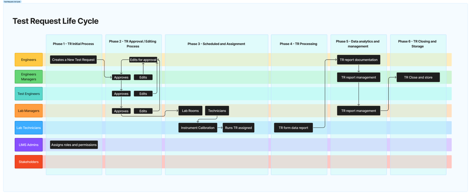
A test request touches multiple approvers in sequence — without role-specific views, the tool would have forced technicians and managers into the same crowded interface built for neither of them.

Continuous Research in an Engineering-Native Culture

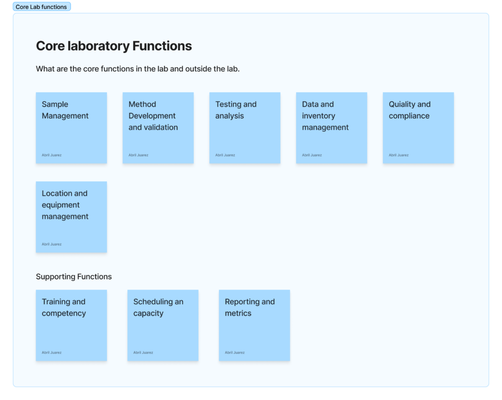
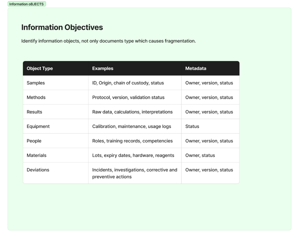
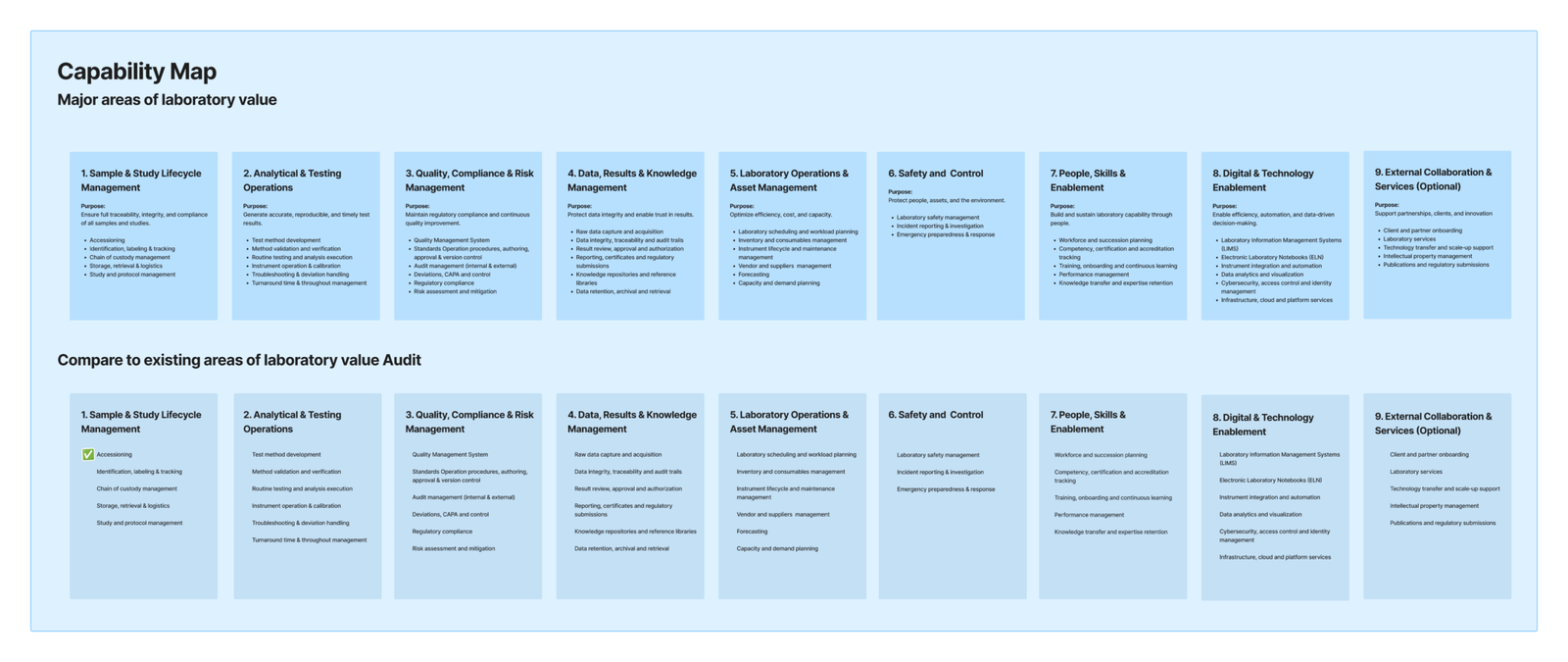
What I did: Held weekly meetings with end users throughout the 18-month build, using their real day-to-day friction to prioritize what got designed next, rather than working from a fixed spec handed down up front. I ran quarterly UX audits, documented in Figma, and mapped the evolving information architecture in FigJam as the platform’s roles and workflows became clearer.

Tools: Used AI tools in a supporting role for early-stage drafting — structuring interview guides and doing lightweight competitor scans — to leave more time for the actual user conversations and audit work.

Why it mattered: Daikin’s culture is engineering-first; UX had to earn its place by showing, repeatedly, that user feedback changed what got built. Weekly cycles and quarterly audits made that visible rather than theoretical.

A Feedback Loop Built Into the Workflow

What I did:Set up a third-party feedback board where users could log friction points as they worked with the tool day to day, and used that steady stream of input to help shape the agile team’s backlog priorities.

Design Approach:
Ran quarterly UX audits in Figma against the live product, translated recurring feedback into wireframes and prototypes, then validated design directions with A/B testing before they went into the design system.

Why it mattered:
For a tool with no precedent to test against, live feedback from real lab workflows — checked quarterly against a structured audit — was the closest thing to ground truth available.

The Challenge

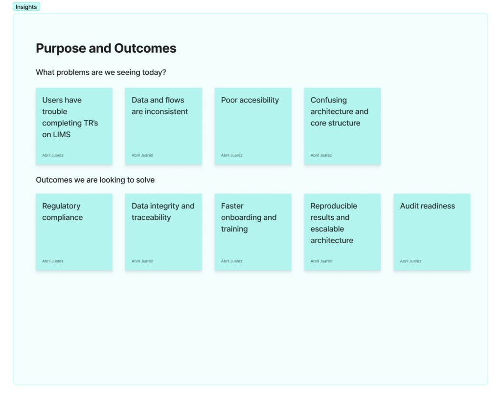
How do you replace an entire lab’s Excel-based workflow with a single piece of software — one that has to serve five different roles, with no existing digital system to build from, in a culture where engineering, not UX, has traditionally led product decisions?

There was no legacy digital tool to migrate from and no existing onboarding process for new users. Every workflow — test requests, approvals, scheduling, lab capability management, inventory — had to be mapped and designed from the ground up, while stakeholders expected a working, adopted product on a fast timeline.

The Outcome

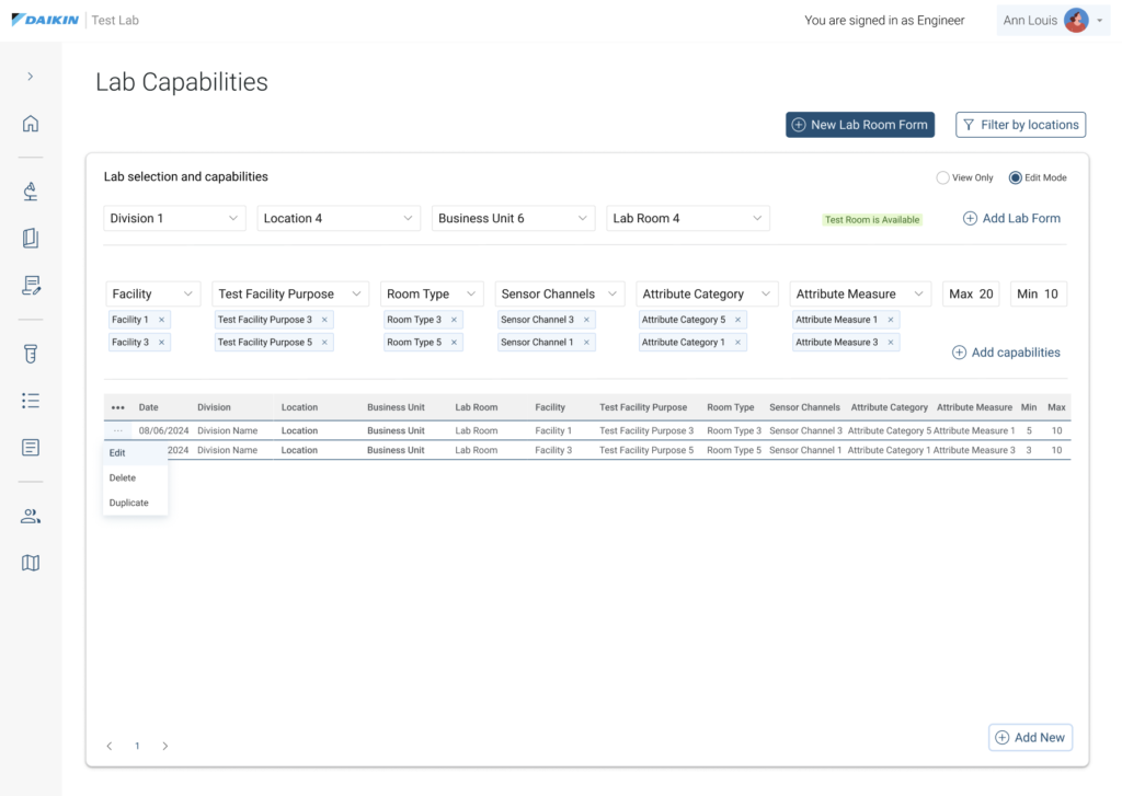
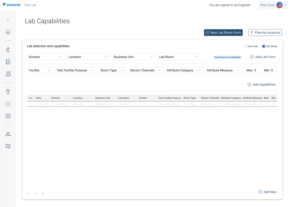
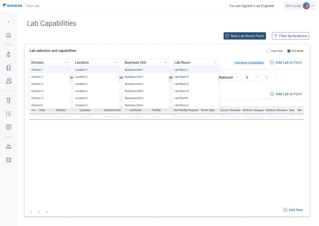
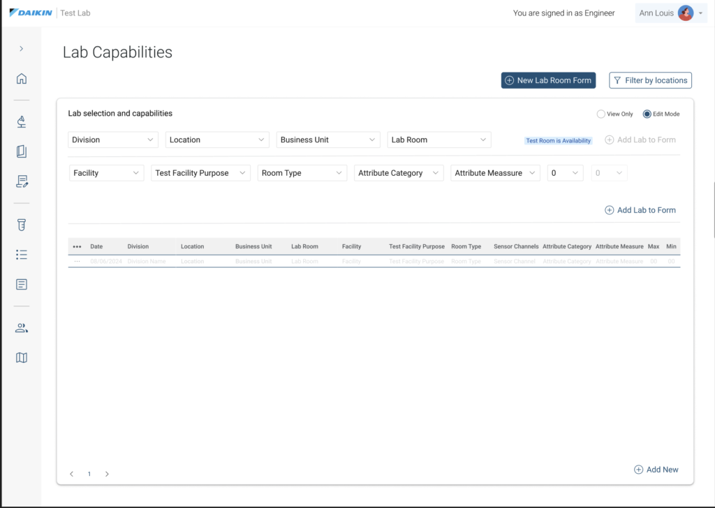
Over 18 months, the team built LIMS into the lab’s single source of truth: a role-based platform covering test request submission, multi-step approval tracking, scheduling, lab capability configuration, and an onboarding/FAQ system that hadn’t existed in any form before.

Continuous user research and a live feedback loop shaped the backlog throughout the build, rather than front-loading requirements once and building to spec.

One platform, seven different jobs

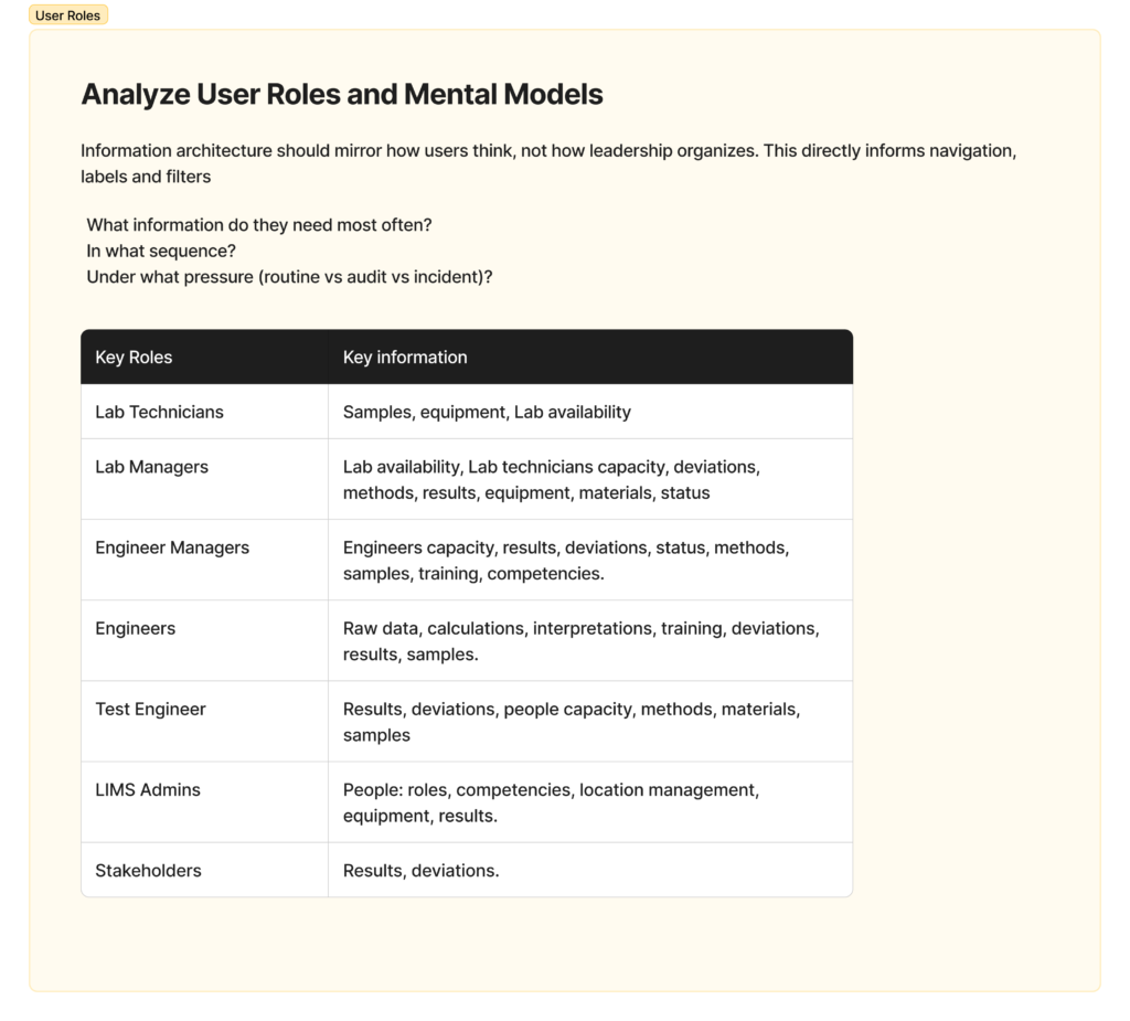
Seven roles needed the same underlying data — samples, equipment, results, deviations, capacity — but each needed a different slice of it:

Lab Technicians
Lab Managers
Engineer Managers
Engineers
Test Engineers
LIMS Admins
Stakeholders
Samples, equipment, lab availability
Lab availability, technician capacity, deviations, methods, results, equipment, materials, status
Engineer capacity, results, deviations, status, methods, samples, training, competencies
Raw data, calculations, interpretations, training, deviations, results, samples
Results, deviations, people capacity, methods, materials, samples
People/roles, competencies, location management, equipment, results
Results, deviations

A technician needs to see what’s assigned to them and log results. A manager needs team-wide capacity and deviation status. A stakeholder just needs results and deviations, with none of the operational detail. Designing one system that served all seven without becoming generic to everyone — or turning into seven disconnected tools — was the core information architecture problem.

Designing within strict constraints

The project had to:

  • Migrate every existing Excel-based workflow into a single platform, from zero.
  • Support distinct permissions and personalized views for five roles.
  • Build an onboarding and user-guidance system where none had existed.
  • Move at a pace stakeholders considered fast enough to justify the investment, in a culture where engineering decisions typically came first.

I found that advocating for user research in that environment worked best by showing results early and often — weekly interviews and a live feedback board did more to build trust in the process than any single upfront research report could have.

Aligning diverse perspectives

Working across the team: At TBWA\WorldHealth, I connected creative direction, copywriting, and development to keep the site cohesive as it moved through production.

Working with the client: I joined workshops with Regeneron stakeholders to align UX decisions with business goals, brand strategy, and regulatory requirements, and coordinated with external research and media agencies to keep the experience consistent across touchpoints.

Exploring the AI phase: As the project evolved, I researched chatbot vendors and evaluated how a conversational tool could help users find information faster, within compliance limits.

Translating research into structure

I organized the site around each audience’s needs rather than around the product itself. Instead of one navigation path for everyone, I helped shape an audience-first structure that reduced how much users had to dig through to find what mattered to them.


I worked with a third-party research team to bring in findings from patient focus groups, usability testing, and persona work. Those findings shaped how information was grouped and labeled, so navigation decisions were based on how people actually looked for information — not on assumptions.

Designing for multiple mental models

Patients, caregivers, and HCPs came to the site with different goals and different levels of medical knowledge. I helped build separate navigation paths for each group, while keeping safety information visible no matter which path someone was on.

Aligning UX with content and compliance

The information architecture went through several rounds with copywriters, creative directors, developers, and regulatory reviewers. Together we refined the sitemap, navigation labels, and page hierarchy so the site stayed clear, on-brand, accessible, and compliant before it went into development.

INCLUSION BY DESIGN

Accessibility wasn’t a checklist item at the end — it shaped decisions from the start. In a regulated pharma environment, every interaction needed to hold up under WCAG standards while keeping medical information clear and usable for a wide range of users.

WCAG Standards

I worked with developers to review navigation patterns, content hierarchy, color contrast, keyboard interactions, and page structure against WCAG best practices, across responsive layouts and assistive technologies.

SAFETY FIRST

One of the harder problems was presenting Important Safety Information (ISI) in a way that met FDA requirements without burying the rest of the page. Typography, spacing, and layout decisions kept safety content visible and easy to find throughout the experience.

Balancing Clinical Complexity with Operational Efficiency

This project showed that FDA and WCAG AAA compliance doesn’t have to come at the cost of good design — the two can work together. One of the clearer wins outside the interface itself was how we ran cross-functional review: I recorded short, component-focused Loom walkthroughs for medical, product, and legal stakeholders, which sped up approval turnaround and gave engineering clear documentation to build from.

My take aways

Pharma platforms aren’t just data repositories or polished interfaces — this project reinforced how much user empathy shapes whether people actually engage with the information they need. 


Designing for someone who’s anxious and possibly overwhelmed means being deliberate about what they see first, and making sure they feel supported at each step, not just informed.

What I would do different

I’d bring clients and end users into structured workshops earlier — from day one rather than mid-project.


It’s more upfront effort to organize, but it surfaces the gap between what stakeholders assume and what users actually need much sooner, which saves rework later.

From blue print to production:

Ecosystem showcase

A curated retrospective tracking the design lifecycle—spanning foundational structural wireframes, high-fidelity responsive interfaces, and finalized cross-channel campaign assets.

Social Media Campaigns and organic web ads

© 2026 Abril Alejo. All rights reserved.