FDA-regulated healthcare web experience.

I led the UX for Libtayo, a newly approved oncology treatment, working within TBWA\WorldHealth on the Regeneron account. My focus was the information architecture and responsive design for a site serving three very different audiences — patients, caregivers, and healthcare professionals — inside strict FDA and WCAG AAA constraints. The scope also included web ads and cross-channel campaign assets, and later expanded into an AI-assisted chatbot.

Skills

Responsive Web Design

UX/UI

Sitemap architecture

Wireframe

Documentation

Tools

Figma

Adobe Creative Cloud

Adobe Creative Cloud

Project Directory

Role
Key Responsibilities
Methods
Teams Involved
Focus Areas
Project Type
Lead UX Designer
Sitemap, information architecture, accessibility testing, UX strategy, cross-functional collaboration, Al chatbot research and implementation support
Client workshops, persona-based UX review, user research synthesis, accessibility review, information architecture, collaborative design process
Client stakeholders, creative team, account team, copywriters, developers, third-party researchers, digital marketing partners, Al vendor teams
Responsive web experience, accessibility standards, regulated healthcare UX, Al-assisted customer support
Pharmaceutical Website, Digital Marketing, Accessibility, Conversational UX

“The FDA rules weren’t a constraint I worked around — they were the brief. Every navigation decision had to hold up against them.

– Abril J. Alejo

Key Insights & Impact

AI Integration for patients

The Strategy: Partnered with cross-functional engineering teams and third-party vendors to deploy an AI-augmented conversational assistance model under strict healthcare guardrails.

Design Approach: Maintained complete visual consistency across the interactive chat flows and modal states by utilizing unified Figma tokens, clear focus indicators, and strict typographic scaling.

The Impact: Replaced text-heavy multi-page navigation with a chat entry point that gave patients a faster way to reach onboarding and co-pay information.

Organic Cross-Channel Engagement

The Strategy: Extended the site’s design tokens and UI patterns into organic social and web ad assets, keeping everything inside FDA content rules.

Qualitative Validation: We didn’t have analytics access for this phase, so the agency ran qualitative focus groups instead. Participants recognized the campaign and recalled the treatment name and key messages.

The Impact: Visual consistency between the site and the ads made the brand easier to recognize across touchpoints — useful in a category where paid acquisition is heavily restricted.

Enterprise Risk Mitigation

The Strategy: Audited color contrast, keyboard navigation, and responsive layouts against WCAG AAA standards, working with developers to close gaps.

Regulatory Compliance: Required legal safety information (ISI) had to stay visible and readable without overwhelming the page.

The Impact: Strict adherence to FDA regulations and WCAG AAA standards upfront meant fewer accessibility fixes late in development, and safety content that regulators and users could both find easily.

The Challenge

This wasn’t just a compliance exercise. The site needed to serve three audiences with very different needs, fit into a larger omnichannel campaign, and leave room for a second phase built around AI-assisted support.

The Outcome

The final site organized complex medical content around each audience’s needs rather than around the product itself, while meeting FDA and WCAG AAA requirements. A later phase added an AI chatbot to help users find relevant information through guided conversation.

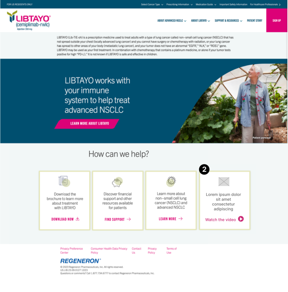
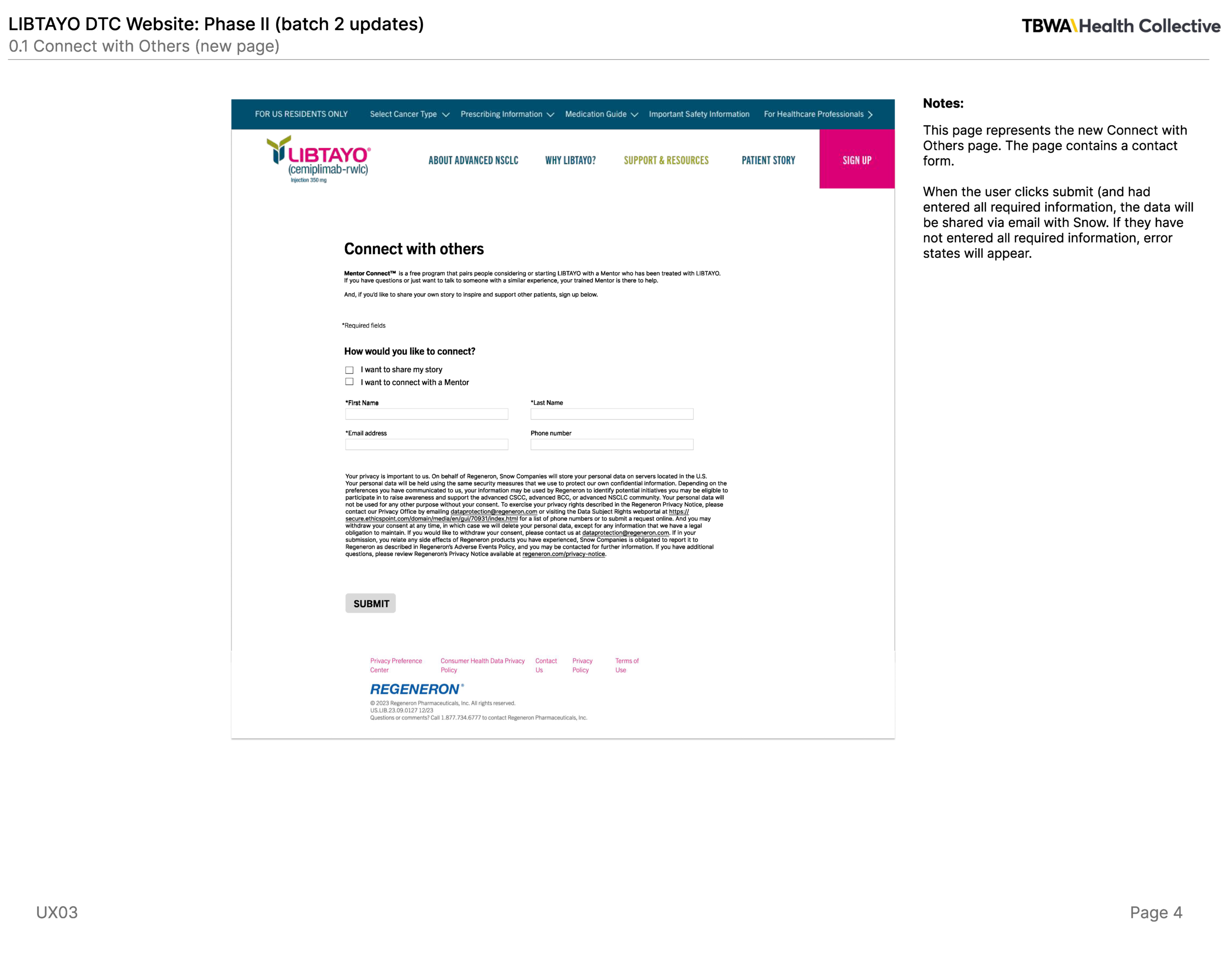
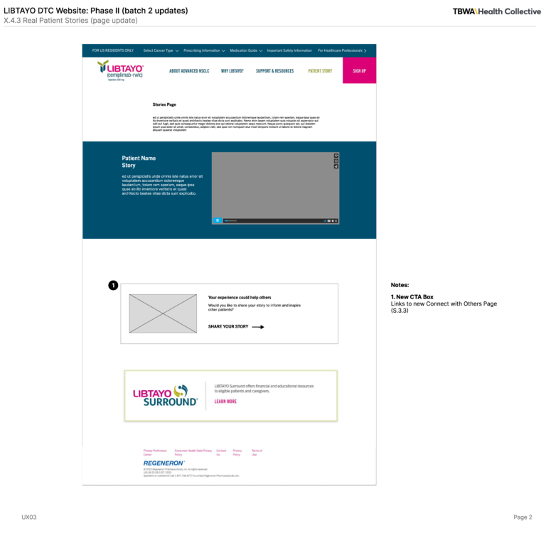
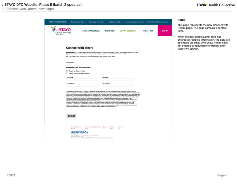
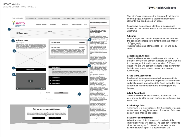
Libtayo wireframes homepage

One product, 3 user journeys

Libtayo wasn’t just another pharma launch — it meant designing one experience that could hold three different mental models without splitting into three disconnected sites.

  • Patients wanted clear, reassuring information about their treatment.
  • Caregivers wanted practical guidance they could reference and share quickly.
  • Healthcare professionals needed fast access to prescribing information, clinical data, and safety details.

The hardest part wasn’t designing for any one group — it was doing it without fragmenting the information architecture or duplicating content three times over.

Designing within strict constraints

The site had to:

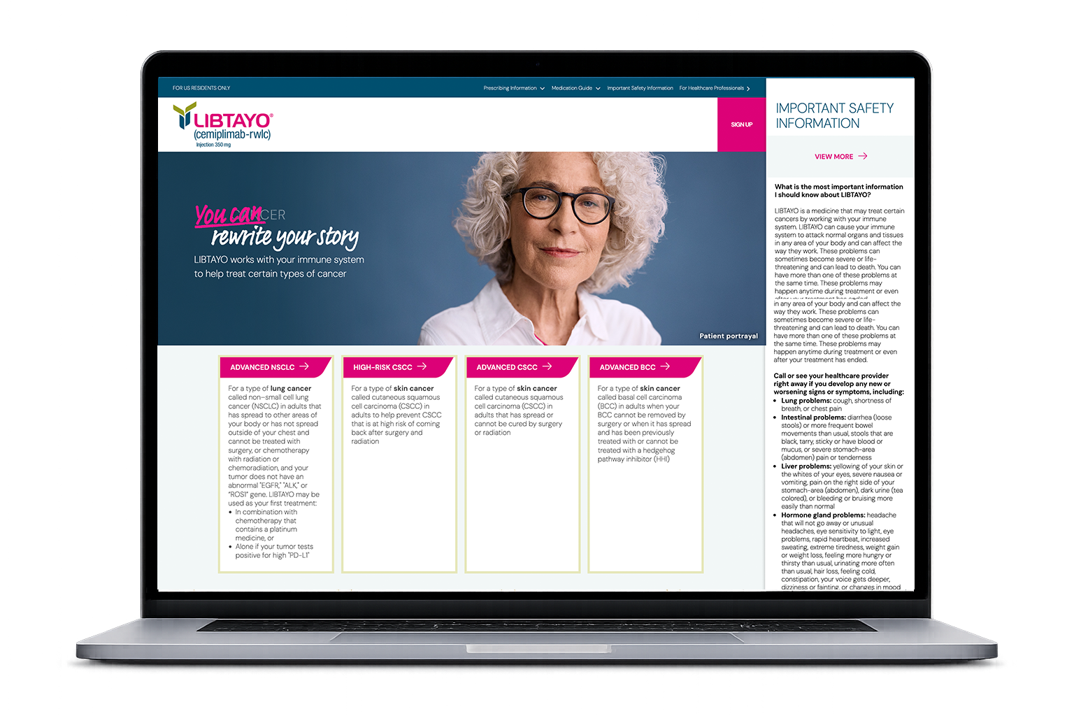
  • Present safety information with clarity and prominence, not buried.
  • Meet FDA and accessibility regulations.
  • Stay consistent with the broader brand campaign.
  • Leave room for future features like the AI assistant.


I found these constraints useful rather than limiting — they gave every design decision a clear test to pass.

Aligning diverse perspectives

Working across the team: At TBWA\WorldHealth, I connected creative direction, copywriting, and development to keep the site cohesive as it moved through production.

Working with the client: I joined workshops with Regeneron stakeholders to align UX decisions with business goals, brand strategy, and regulatory requirements, and coordinated with external research and media agencies to keep the experience consistent across touchpoints.

Exploring the AI phase: As the project evolved, I researched chatbot vendors and evaluated how a conversational tool could help users find information faster, within compliance limits.

Translating research into structure

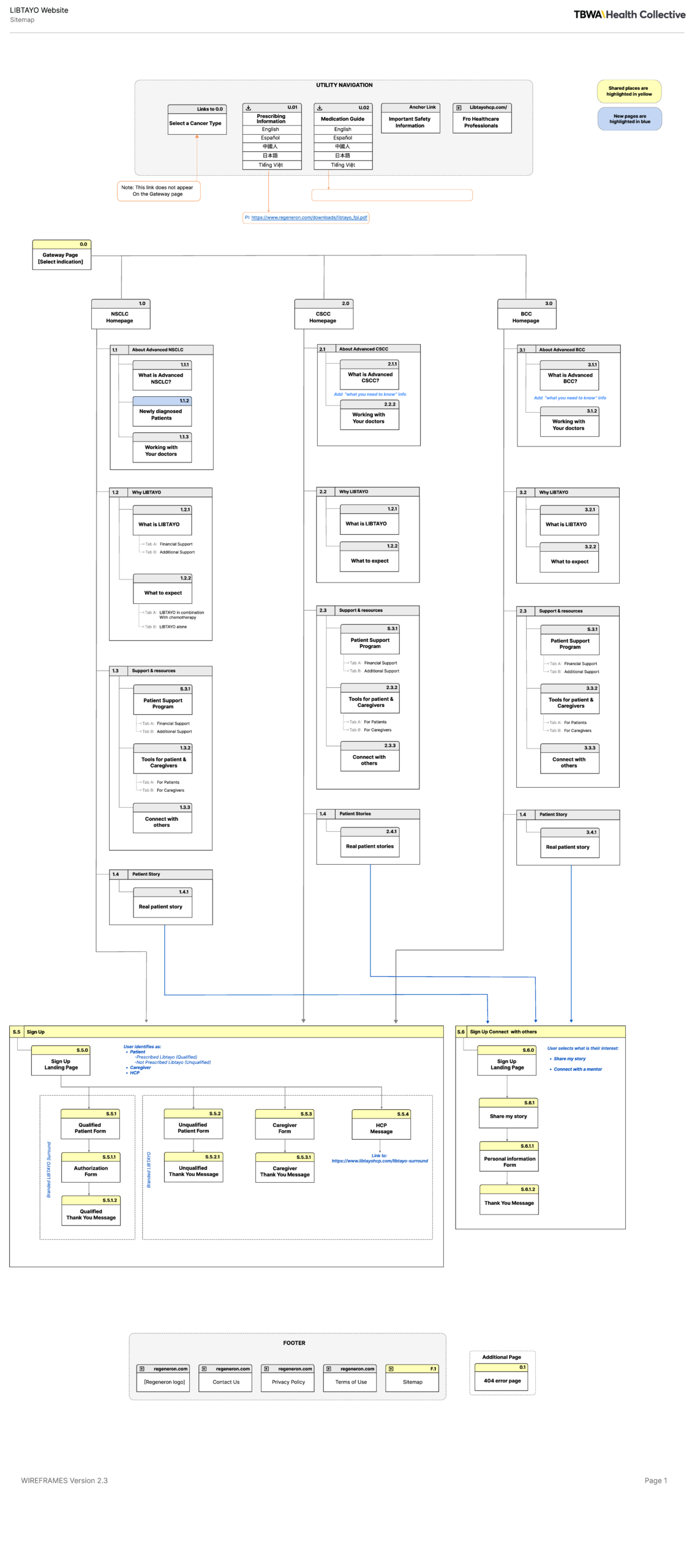
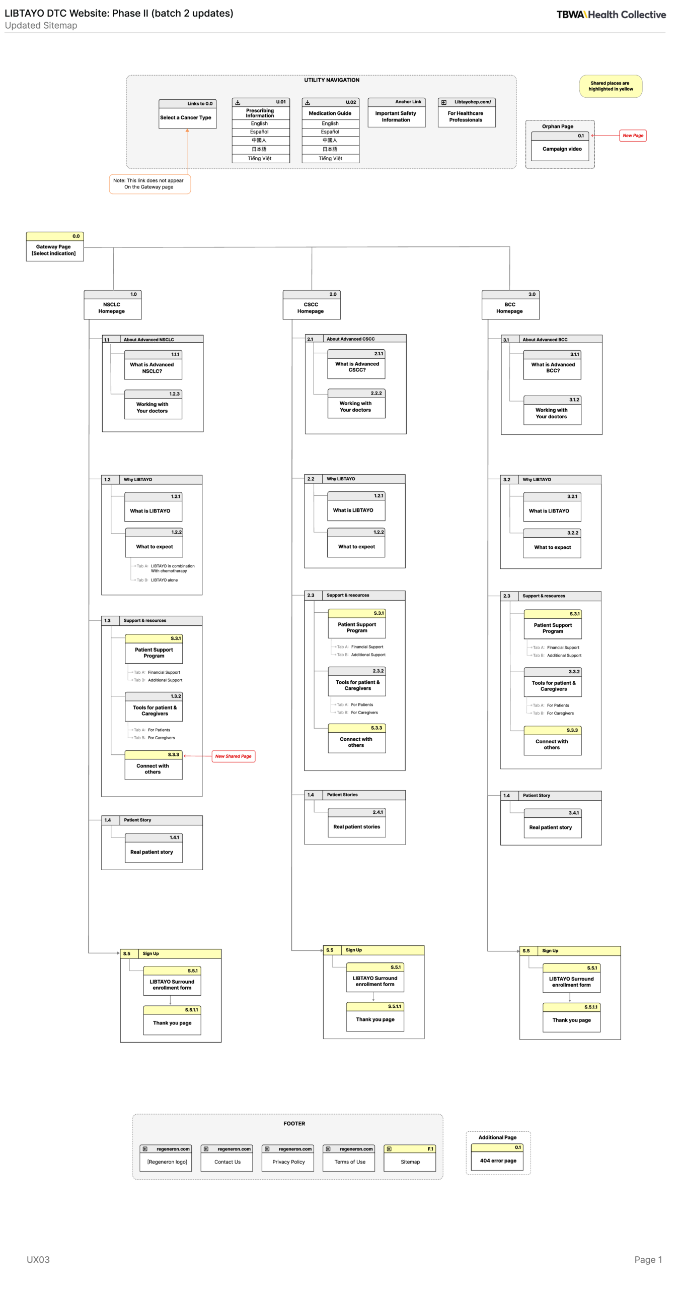
I organized the site around each audience’s needs rather than around the product itself. Instead of one navigation path for everyone, I helped shape an audience-first structure that reduced how much users had to dig through to find what mattered to them.


I worked with a third-party research team to bring in findings from patient focus groups, usability testing, and persona work. Those findings shaped how information was grouped and labeled, so navigation decisions were based on how people actually looked for information — not on assumptions.

Designing for multiple mental models

Patients, caregivers, and HCPs came to the site with different goals and different levels of medical knowledge. I helped build separate navigation paths for each group, while keeping safety information visible no matter which path someone was on.

Aligning UX with content and compliance

The information architecture went through several rounds with copywriters, creative directors, developers, and regulatory reviewers. Together we refined the sitemap, navigation labels, and page hierarchy so the site stayed clear, on-brand, accessible, and compliant before it went into development.

INCLUSION BY DESIGN

Accessibility wasn’t a checklist item at the end — it shaped decisions from the start. In a regulated pharma environment, every interaction needed to hold up under WCAG standards while keeping medical information clear and usable for a wide range of users.

WCAG Standards

I worked with developers to review navigation patterns, content hierarchy, color contrast, keyboard interactions, and page structure against WCAG best practices, across responsive layouts and assistive technologies.

SAFETY FIRST

One of the harder problems was presenting Important Safety Information (ISI) in a way that met FDA requirements without burying the rest of the page. Typography, spacing, and layout decisions kept safety content visible and easy to find throughout the experience.

Balancing Clinical Complexity with Operational Efficiency

This project showed that FDA and WCAG AAA compliance doesn’t have to come at the cost of good design — the two can work together. One of the clearer wins outside the interface itself was how we ran cross-functional review: I recorded short, component-focused Loom walkthroughs for medical, product, and legal stakeholders, which sped up approval turnaround and gave engineering clear documentation to build from.

My take aways

Pharma platforms aren’t just data repositories or polished interfaces — this project reinforced how much user empathy shapes whether people actually engage with the information they need. 


Designing for someone who’s anxious and possibly overwhelmed means being deliberate about what they see first, and making sure they feel supported at each step, not just informed.

What I would do different

I’d bring clients and end users into structured workshops earlier — from day one rather than mid-project.


It’s more upfront effort to organize, but it surfaces the gap between what stakeholders assume and what users actually need much sooner, which saves rework later.

From blue print to production:

Ecosystem showcase

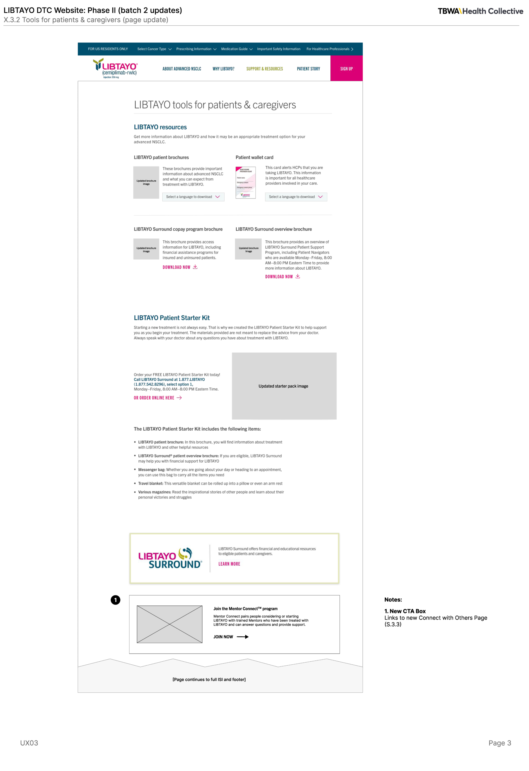
A curated retrospective tracking the design lifecycle—spanning foundational structural wireframes, high-fidelity responsive interfaces, and finalized cross-channel campaign assets.

Social Media Campaigns and organic web ads

© 2026 Abril Alejo. All rights reserved.